

GED Math Graphs and Functions 2026: Data & Stats
Graphs and functions is a quarter of the GED math test — the second-largest reporting category. This lesson covers reading every chart type, mean and median, probability, slope, and linear functions, with worked examples throughout.

GED math graphs and functions is 25 percent of the Mathematical Reasoning test, the second-largest of its four reporting categories. It covers reading bar, circle, line, dot, box and scatter plots and tables, calculating mean, median, mode and range, basic probability, locating points on the coordinate plane, finding slope, and moving between the equation, table and graph of a linear function.
What Graphs and Functions Covers on the GED
The category splits into two halves that feel quite different in practice. The data half asks you to represent, display, and interpret categorical data in bar and circle graphs, one-variable data in dot plots, histograms and box plots, and two-variable data in tables and the coordinate plane. It also covers mean, median, mode and range, plus probability of simple and compound events. The function half covers locating points, finding slope from a graph, equation or table, graphing two-variable linear equations, and interpreting key features of a function — intercepts, intervals where it increases or decreases, maximums and minimums. Both halves show up as word problems built around a display rather than as bare calculation. Every target quoted on this page comes from the Assessment Guide for Educators, the document GED items are written against.
Display | What it shows | Skill being tested |
|---|---|---|
Bar graph | Separate categories | Comparing values |
Circle graph | Parts of one whole | Percentages of a total |
Dot plot | Individual values | Frequency and statistics |
Histogram | Numerical intervals | Distribution shape |
Box plot | Spread of the data | Median and quartiles |
Scatter plot | Two-variable relationship | Trend and correlation |
Line graph | Change across an ordered scale | Trends and rate of change |
Coordinate graph | Points and lines | Slope and equations |
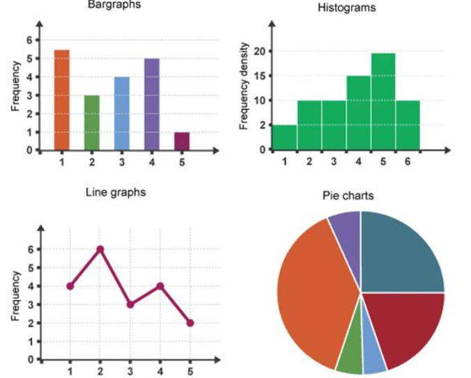
Note that a bar graph and a histogram look similar but answer different questions. A bar graph compares separate categories, so its bars can be reordered without losing meaning. A histogram shows how numerical data distributes across intervals, so its order is fixed and the bars touch. Mistaking one for the other usually means reading a distribution question as a comparison question.
The Five-Step Check Before You Calculate
Do not start calculating the moment a graph appears. Spend a few seconds establishing what you are actually looking at, because a GED display routinely contains information the current question does not need. Read the title to see what the graph presents. Check what each axis measures. Check the units — dollars, miles, people, percentages. Check the scale, because each mark might represent 1, 5, 10 or more. Then reread the question and identify exactly what it wants. That last step is not padding: the same chart can support four different questions, and three of them will have plausible wrong answers sitting in the options.
Reading Each Graph Type
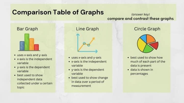
Each display communicates in its own way, and your first job is recognizing which one you have. The three that appear most often on the GED — line, bar and circle — each reward a different reading habit. Line graphs are about change between points. Bar graphs are about differences between categories. Circle graphs are about a share of one fixed total, which means almost every circle-graph item eventually becomes a percentage calculation. Getting this identification right in the first few seconds saves you from the most expensive error in the category, which is running a valid calculation on the wrong kind of question. A comparison performed on a circle graph, or a total performed on a line graph, produces a number that looks reasonable and is simply answering something nobody asked.
Line graphs: look for the change, not the peak
Take weekly study hours of 4, 6, 9, 7, 11, 8 across six weeks. Asked between which two consecutive weeks study time increased the most, compare the changes rather than hunting for the highest point. Week 1 to 2 rises 2, week 2 to 3 rises 3, week 3 to 4 falls, week 4 to 5 rises 4, week 5 to 6 falls. The answer is week 4 to week 5, even though week 5 is also the peak — those two facts coincide here and often will not. The skill is comparing differences between points.
Bar graphs: compare, then watch the scale
Suppose a study center enrols 50 in math, 40 in RLA, 30 in science and 20 in social studies. "How many more in math than science?" is 50 − 30 = 20. A harder version asks what percentage of students take RLA: total the enrollments to 50 + 40 + 30 + 20 = 140, then 40 ÷ 140 × 100 ≈ 28.6%. The second question needs two skills stacked — extracting from the display, then applying a percentage. Also watch the axis: a bar that appears to reach 40 may sit on a scale marked in tens.
Circle graphs: percentage is not the amount
A student budgets $2,000 monthly: housing 40%, food 25%, transportation 20%, utilities 10%, other 5%. Food spending is 0.25 × $2,000 = $500. Food and transportation together is 25% + 20% = 45%, so 0.45 × $2,000 = $900. The recurring trap is stopping at the percentage. If the question asks how much, 25% is not the answer — $500 is.
Tables: find the row and column first
Given monthly study hours of math 12, 15, 18, 20 and RLA 10, 14, 16, 19 across January to April, "how many more math hours than RLA in April?" is 20 − 19 = 1. "Total math hours January through April" is 12 + 15 + 18 + 20 = 65. Both are trivial once you have located the right cells, and both go wrong when you read across a row you did not mean to.
Pin this guide so you can find it again.
We refresh these every season. Save it to a Pinterest board and you’ll get the latest version next time you come back.
Save to PinterestData Analysis: Mean, Median, Mode, and Range
Target Q.7.a asks you to calculate mean, median, mode and range, and also to find a missing data value when given the average and everything else. Take the set 68, 72, 72, 75, 80, 83, 90. The mean is the sum divided by the count: those seven values total 540, and 540 ÷ 7 ≈ 77.14. The median is the middle value once ordered, which here is the fourth number, 75. The mode is the most frequent value, 72. The range is largest minus smallest, 90 − 68 = 22. Four measures, four different questions about the same data — and GED items are usually testing whether you picked the right one.
Why mean and median disagree
Change that highest score from 90 to 150 and watch what happens. The mean shifts substantially, because it uses every value in the calculation. The median stays at 75, because the middle position has not moved. That divergence is not a quirk — it is the reason both measures exist, and GED items test it directly. When a dataset has one extreme value, the median usually describes it better.
Probability Basics
Probability measures how likely an event is, and the core formula is favorable outcomes divided by total possible outcomes. A bag holding 4 red, 3 blue and 2 green balls has 4 + 3 + 2 = 9 balls in total, so the probability of drawing blue is 3/9, which simplifies to 1/3. The same value can be written as a decimal, 1 ÷ 3 ≈ 0.333, or a percentage, roughly 33.3%. Which form you give depends on what the question asks for, and answering in the wrong form is a common avoidable loss. Targets Q.8.a and Q.8.b extend this to counting techniques, combinations and permutations, and compound events.
The Coordinate Plane and Slope
Coordinates come down to one rule: (x, y) means horizontal first, then vertical. The point (3, 2) is 3 along and 2 up. Quadrant I has both coordinates positive, quadrant II has x negative and y positive, quadrant III has both negative, and quadrant IV has x positive and y negative — so (−3, 2) is in quadrant II and (4, −1) is in quadrant IV. Slope then measures how much y changes as x changes, using m = (y₂ − y₁) ÷ (x₂ − x₁), which is rise over run. For a line through (1, 2) and (4, 8), that is (8 − 2) ÷ (4 − 1) = 6 ÷ 3 = 2. Positive slopes rise left to right; negative slopes fall.
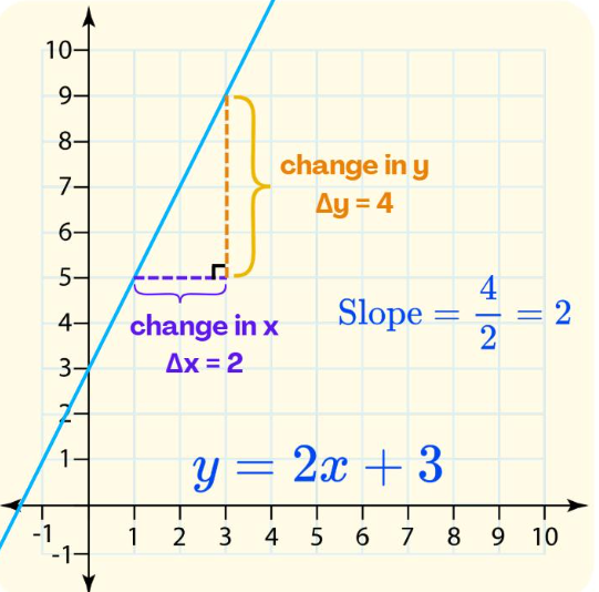
Reading slope straight off a graph is usually faster than computing it. Pick two points where the line passes cleanly through grid intersections, count the vertical change, count the horizontal change, and divide. Target A.5.b requires you to find slope from a graph, an equation, or a table, so practice all three routes rather than only the formula.
Linear Functions: Equation, Table, and Graph
The most useful skill in this whole category is recognizing that one relationship can wear several costumes. Take y = 2x + 1, where 2 is the slope and 1 is the y-intercept. Build a table and every row is a point on that same line: x = −2 gives y = −3, x = −1 gives −1, x = 0 gives 1, x = 1 gives 3, x = 2 gives 5. Check one — at x = 2, y = 2(2) + 1 = 5, so (2, 5) sits on the line. Target A.7.d asks you to compare two functions each presented differently, such as a table against an algebraic expression, and decide which has the greater rate of change. A function, by target A.7.b, is simply a relationship where each input produces exactly one output.
What to look for in any linear graph
Slope — how steeply is it changing, and in which direction?
y-intercept — where does it cross the vertical axis?
Increasing or decreasing — and over which intervals?
Specific values — what does the line say at a given x?
Practice Questions
Work these before reading the answers. They deliberately span the category rather than drilling one skill, because the real difficulty on test day is recognizing which type of question you are looking at. These are original examples written for GED preparation and are not official GED test questions.
1. A bar graph shows 24 students in math, 18 in RLA, 15 in science, 13 in social studies. How many more in math than science? — 24 − 15 = 9.
2. A box plot has a minimum of 42 and a maximum of 96. What is the range? — 96 − 42 = 54.
3. A scatter plot shows test scores rising as practice hours rise. What relationship is that? — A positive relationship. Note it does not prove practice caused the scores.
4. A bag holds 5 red, 2 blue, 3 green. Probability of green? — 3 ÷ 10 = 3/10, or 30%.
5. Find the slope between (2, 5) and (6, 13). — (13 − 5) ÷ (6 − 2) = 8 ÷ 4 = 2.
Common GED Graph Mistakes
Almost every avoidable loss in GED math graphs and functions is a reading error rather than a calculation error, which is encouraging — reading errors are cheaper to fix. Seven account for most of them, and each has a one-line countermeasure you can run before committing to an answer.
Ignoring the scale. Intervals of 5, 10 or 20 change every value you read off.
Reading the wrong axis. Confirm which variable each axis carries before extracting anything.
Confusing a percentage with an amount. 30% on a chart still needs converting to the actual figure.
Treating correlation as causation. Two variables can rise together without one causing the other.
Confusing median and mean. One is a position, the other is a calculation over every value.
Finding the largest value when asked for the largest change. Those are different questions.
Forgetting units. A bare number can mean the wrong thing entirely.
On test day, run four steps in order — read, identify, calculate, check. Read the title, labels, scale and units. Identify the specific information the question needs. Calculate with the right operation. Check that the answer is plausible and answers the exact question asked. The same discipline carries across the rest of the test; how to pass the GED math test builds it into a full pacing plan, and the GED math cheat sheet condenses the statistics formulas onto one page.
Questions people ask.
- What does GED math graphs and functions cover?
Bar graphs and circle graphs for categorical data, dot plots, histograms and box plots for one-variable data, and scatter plots and coordinate graphs for two-variable data. Tables appear throughout. The assessment targets require you to represent, display, and interpret each of these, not merely read a value off them.
- How much of the GED math test is graphs and functions?
Approximately 25 percent. GED Testing Service divides the Mathematical Reasoning test into four reporting categories: quantitative problem solving with rational numbers (25%), quantitative problem solving in measurement (20%), algebraic problem solving with expressions and equations (30%), and algebraic problem solving with graphs and functions (25%).
- How to read a GED graph correctly?
Read the title, check what each axis measures, check the units, check the scale, then reread the question. The scale is where most points are lost — a bar that looks like it reaches 40 may sit on an axis marked in tens. A graph often contains information a particular question does not need.
- How does GED data analysis work — mean, median, mode, range?
The mean is the sum divided by how many values there are. The median is the middle value once the data is ordered. The mode is the value appearing most often. The range is the largest value minus the smallest. Target Q.7.a also asks you to find a missing value when given the average and the rest of the data.
- What is GED math slope and how do I calculate it?
Slope measures the rate of change between two points, calculated as (y₂ − y₁) ÷ (x₂ − x₁), or rise over run. Between (1, 2) and (4, 8) the slope is 6 ÷ 3 = 2. A positive slope rises left to right; a negative slope falls. Target A.5.b requires finding slope from a graph, an equation, or a table.
- Is probability on the GED math test?
Yes. Targets Q.8.a and Q.8.b cover counting techniques, combinations and permutations, and the probability of simple and compound events. The core formula is favorable outcomes divided by total possible outcomes — a bag of 4 red, 3 blue and 2 green balls gives a 3/9, or 1/3, chance of drawing blue.
- What are GED linear functions?
A function is a relationship where every input produces exactly one output. Target A.7.b asks you to identify a function in a table or graph on precisely that basis. GED items represent the same function as an equation, a table, a graph, or a verbal description, and expect you to move between those forms.
- What is the difference between mean and median on the GED?
The mean uses every value, so one extreme number shifts it. The median only depends on position, so it barely moves. In the set 68, 72, 72, 75, 80, 83, 90, changing 90 to 150 pulls the mean up sharply while the median stays at 75. GED items test that distinction directly.
Amara is the editor at Twigera. She came to publishing the long way — a decade teaching the GED in community colleges and adult-learning centers, where she watched students pass not on talent or time, but on the strength of a study plan they actually trusted. Now she shapes the guides students read here for the parent studying after a closing shift, the second-career welder, the grandmother finishing what she started forty years ago. Expect honest timelines, math made survivable, and study plans built around real life — not around a textbook's idea of one.
Take the next step — start today.
Our online GED course includes every subject, a free 30-minute diagnostic, and a 7-day refund on every plan.